872 purchases
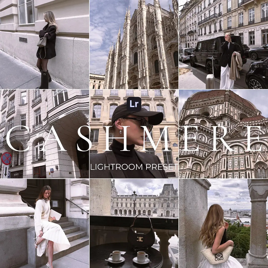
Cashmere
Cashmere
Precio habitual
$7.99 USD
Precio habitual
$19.99 USD
Precio de oferta
$7.99 USD
Precio unitario
por
Impuestos incluidos.
No se pudo cargar la disponibilidad de retiro
CASHMERE: The Ultimate Soft Luxe Filter 🧶✨
✨ Smooth. Refined. Effortless. ✨
In a world of oversaturated edits and excessive contrast, CASHMERE is designed to enhance the beauty of soft, warm elegance.
This preset envelops your images in a luxurious, delicate glow, making every shot look effortlessly sophisticated. Whether you're capturing fashion, beauty, or lifestyle content, CASHMERE ensures a flawless, high-end aesthetic.
Who is CASHMERE for?
🧥 Fashion & Beauty Creators who love an elegant, high-end aesthetic.
🖼️ Photographers capturing soft, polished visuals with a luxurious feel.
🎨 Designers & Aesthetes who appreciate understated sophistication.
📸 Lifestyle Brands looking for a refined, professional touch.
Why Choose CASHMERE?
✅ 4 Elegant Variations – Tailored to different lighting and moods.
✅ Instant Soft Luxe Transformation – Achieve a smooth, polished look effortlessly.
✅ Fashion-Ready Aesthetic – Perfect for editorial, beauty, and luxury content.
✅ Flawless Social Media Presence – Keep your feed chic, cohesive, and professional.
📩 What’s Inside?
• 4 Lightroom Presets (.DNG format) for iOS & Android
• Lifetime Access – Edit anytime, anywhere
• Effortless Installation – Works seamlessly with Lightroom Mobile
• Step-by-Step Guide to get you started instantly
📥 Instant Download
After purchase, you’ll receive an email with the download link so you can start editing immediately.
💬 Need Help?
For any questions or a preview of this filter, contact us at presetprofficial@gmail.com or via IG DM @preset._